kanalhuset identity redesign
Kanalhuset?
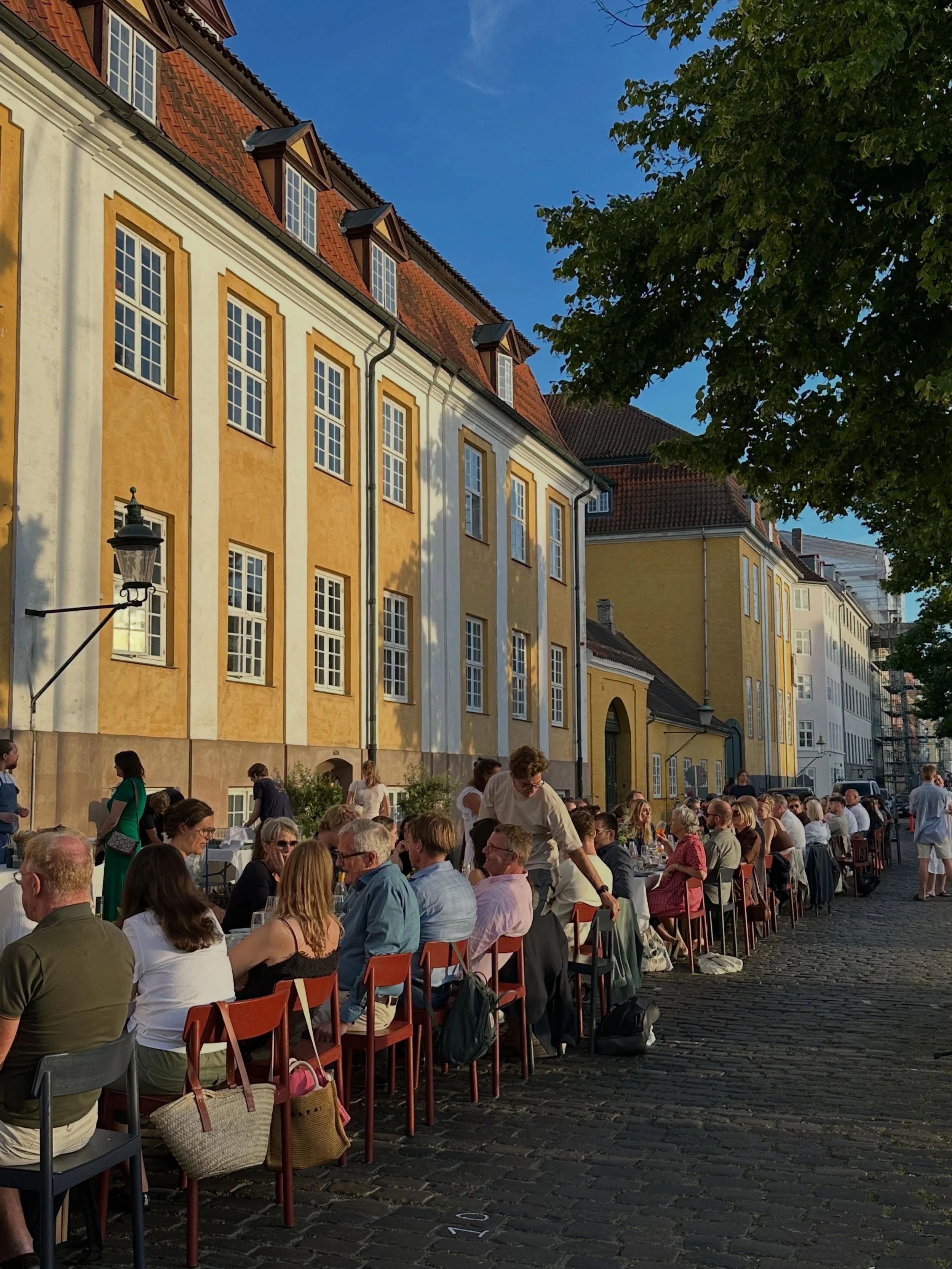
Kanalhuset is a hotel, restaurant, and meeting venue along the Christianshavn Canal in Copenhagen, known for communal dinners and activities that foster authentic connections.
The project involved redesigning their graphic identity. My goal was to bring more personality to the visuals, capturing the venue's lively energy in a way that feels playful yet refined.
Research
Keywords:
Humor · Community · Warmth · Personality · Authenticity
Overview:
Kanalhuset is a historic building dating back to 1754, originally built as a social mobility school for boys across the Danish kingdom. Over the centuries it served as a naval hospital and a trade hub before being reimagined as what it is today, a communal social space and boutique hotel sitting directly on the Christianshavn canal in Copenhagen.
The Experience:
Kanalhuset is designed to feel like a home, not a hotel. Guests and locals share the space equally, gathering for communal dinners each evening, morning swims, yoga, and knitting. Boutique rooms and apartments are each individually designed, with hand-picked interiors that feel warm, lived-in, and personal.
Design Aesthetic:
The interior draws from Scandinavian design of the 1930s –1970s. Clean, minimalist lines, soft curves, natural materials, and a light color palette punctuated by deliberate pops of color. Every space prioritizes craftsmanship and authenticity over uniformity.
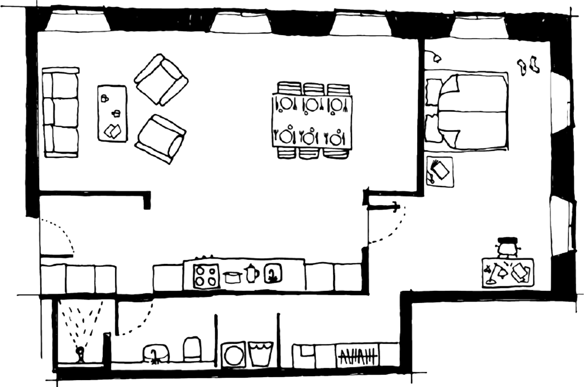
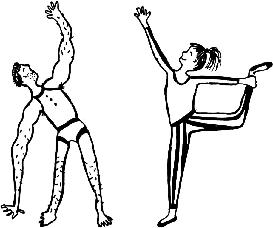
Current Graphics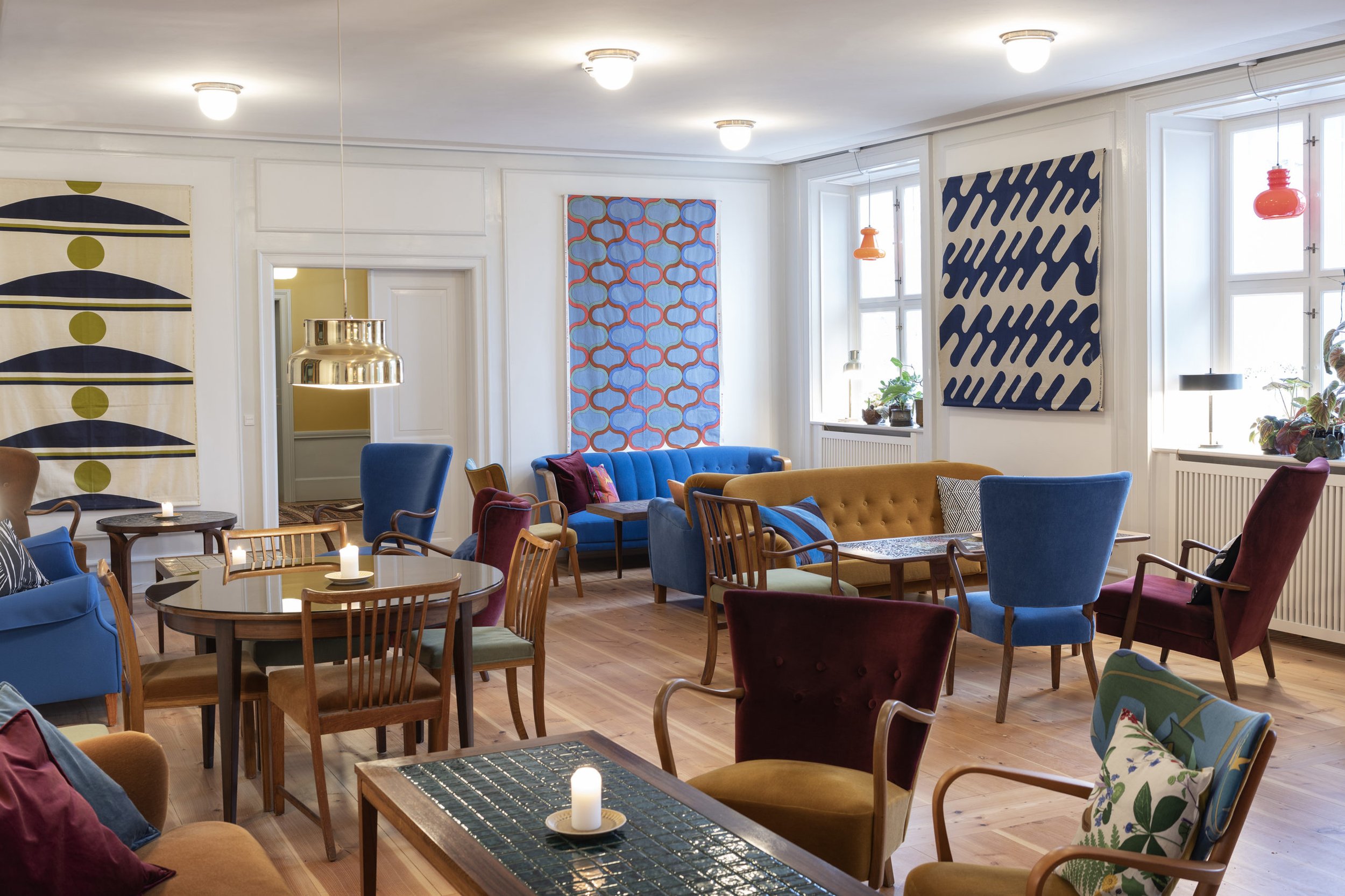
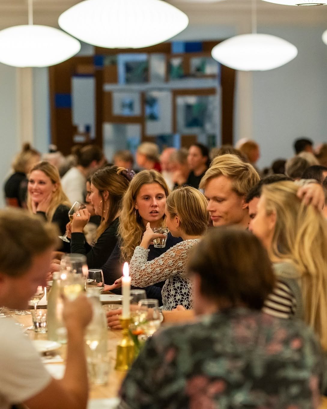
Kanalhuset AestheticInspiration
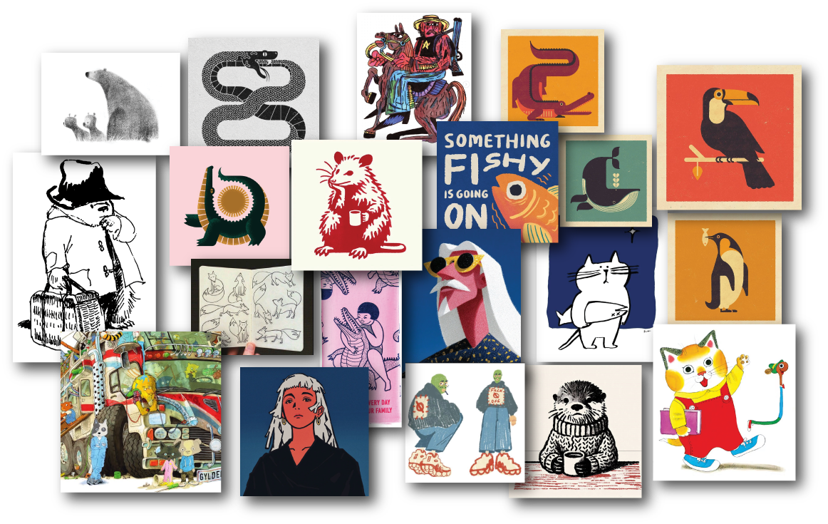
After researching Kanalhuset and learning more about what they want to achieve with their business I began looking for images that would match their aesthetic.
I saved images that had interesting art styles, textures, themes, and forms of storytelling.
Ideation
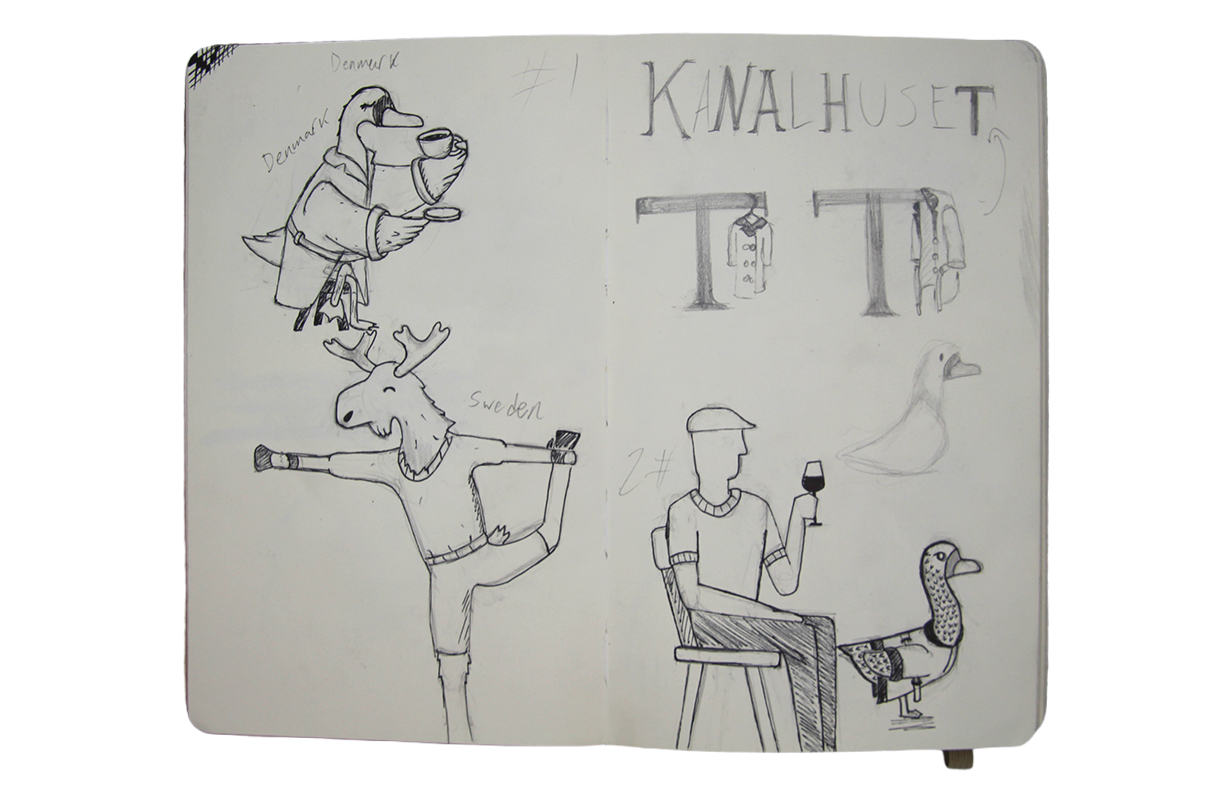
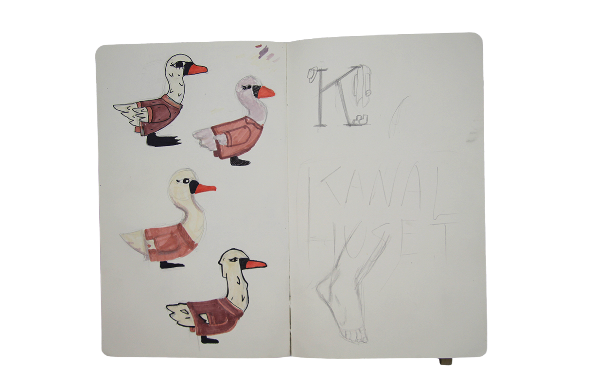
The concept that stuck throughout the project was using anthropomorphic characters to represent Kanalhuset's guests.
Learning that visitors come from across Europe, I decided to use each country's national animal as a way to represent different nations and cultures, for example a swan for Denmark and a moose for Sweden.
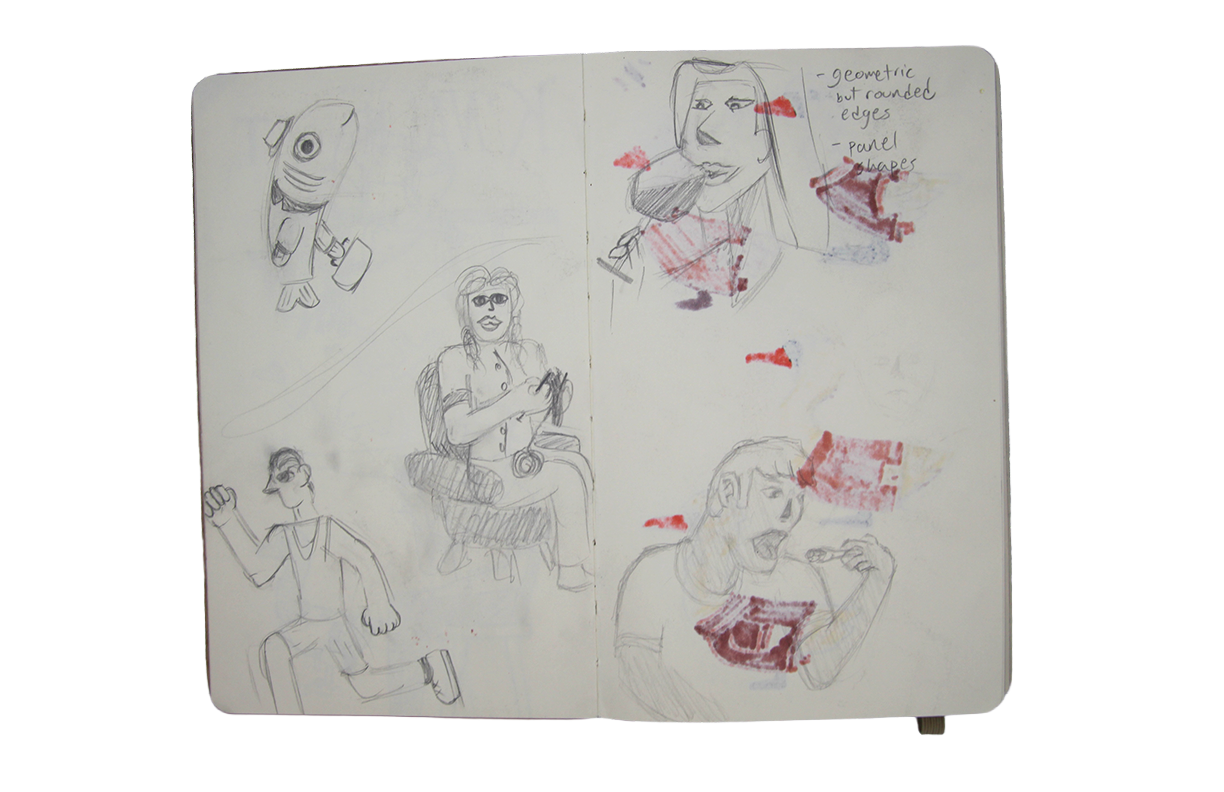
Alongside this, I explored a range of illustration styles to find the right visual tone.
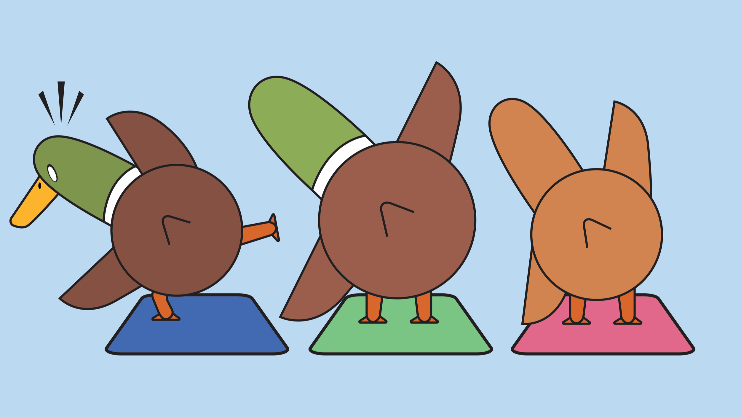
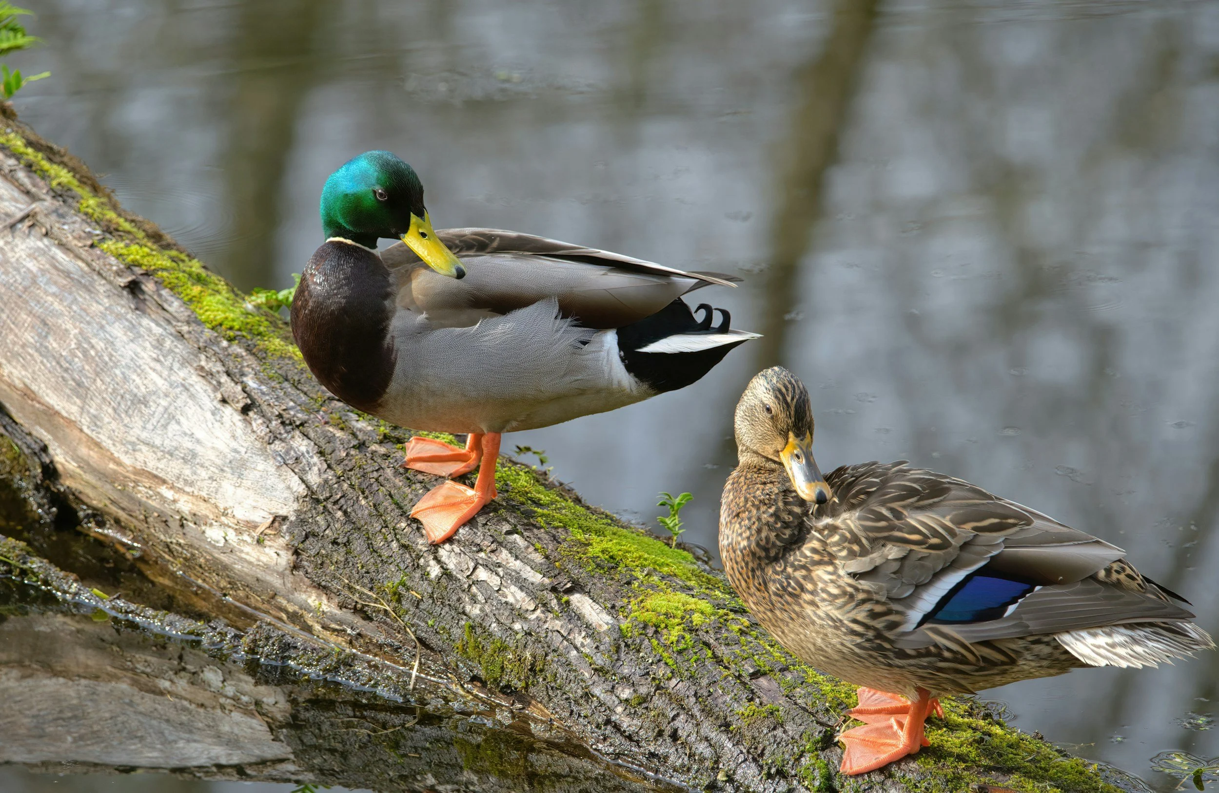
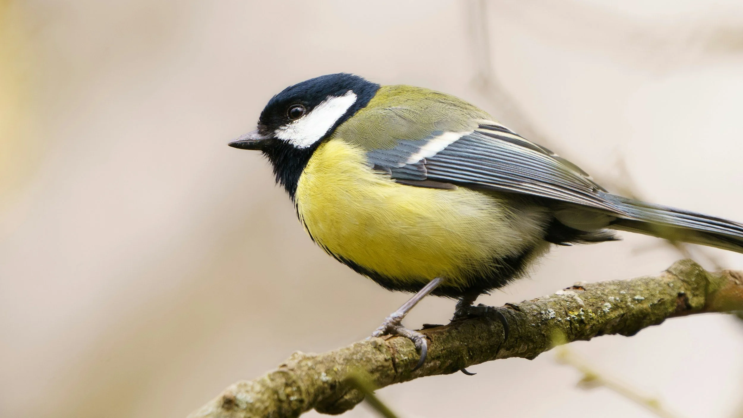
Given our time constraints, I simplified the concept to a single animal. I had the choice between a duck and a great tit bird, both animals that were visible in the Christianshavn area.
I chose a duck since they’re more common to see swimming in the canal outside Kanalhuset. From there, the challenge was finding an illustration style that felt humorous without being childish.
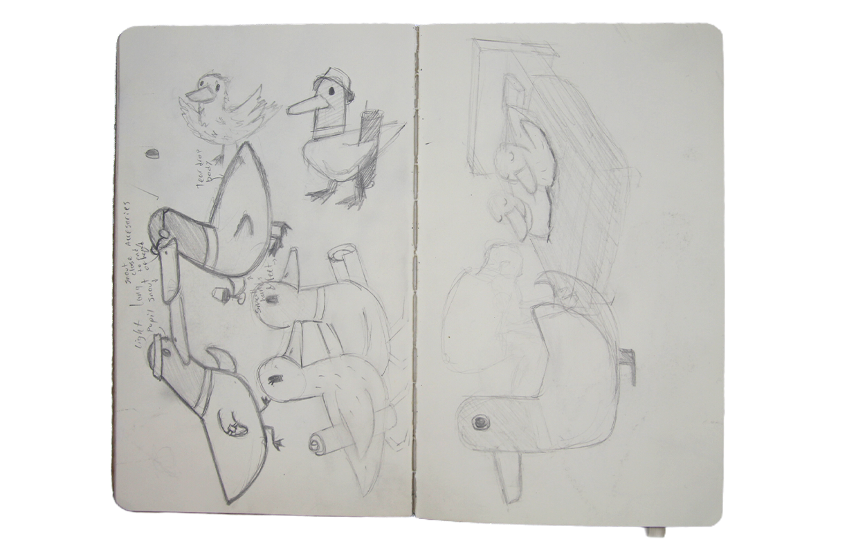
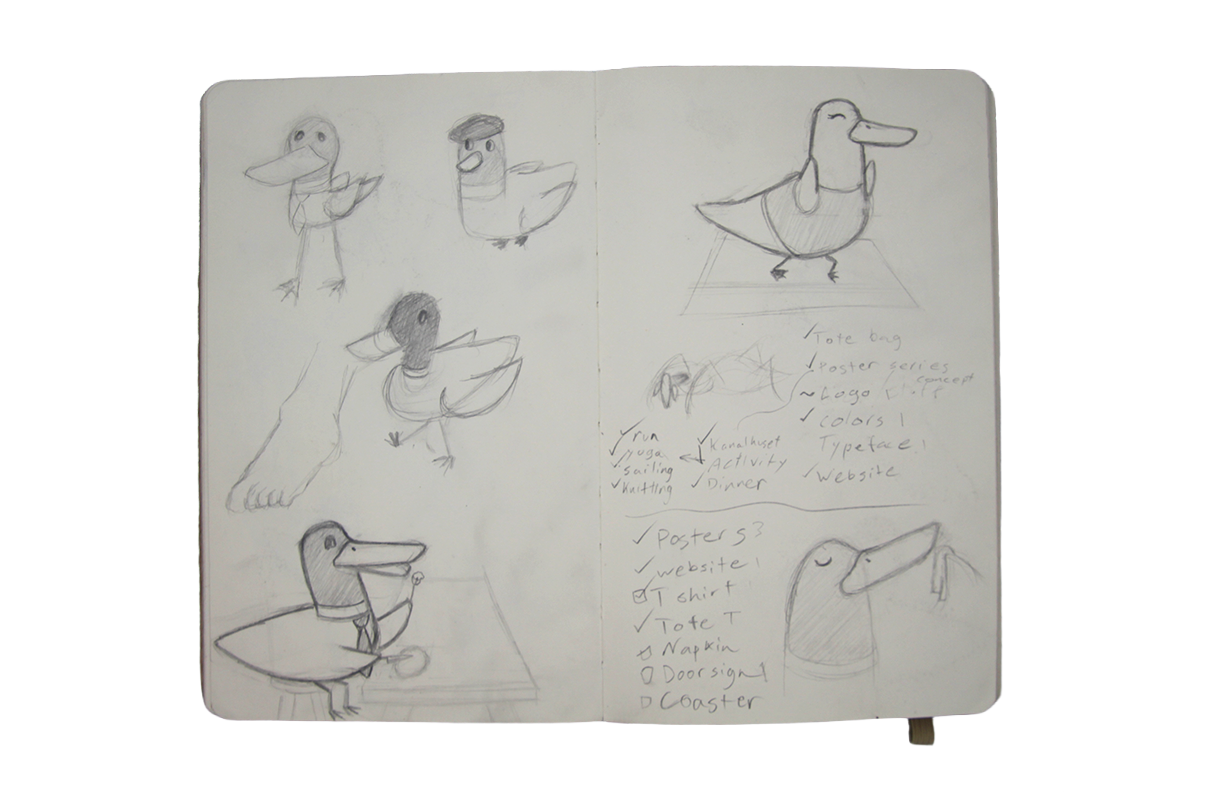
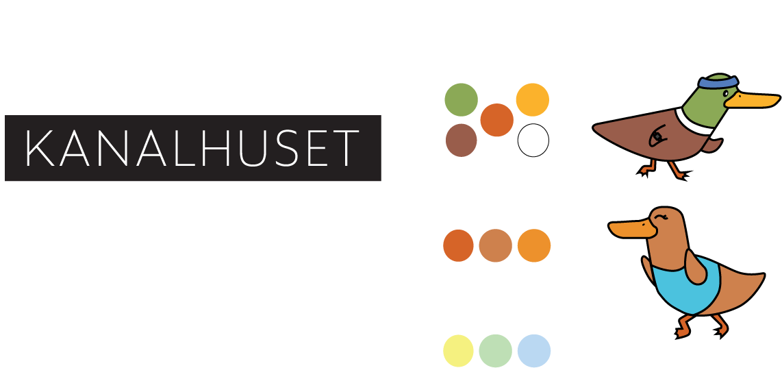
With the duck's style finalized, I moved onto the logo. Since the duck is quite complex I thought it would make sense to keep the logo simple and clean to avoid it from getting to be to much.
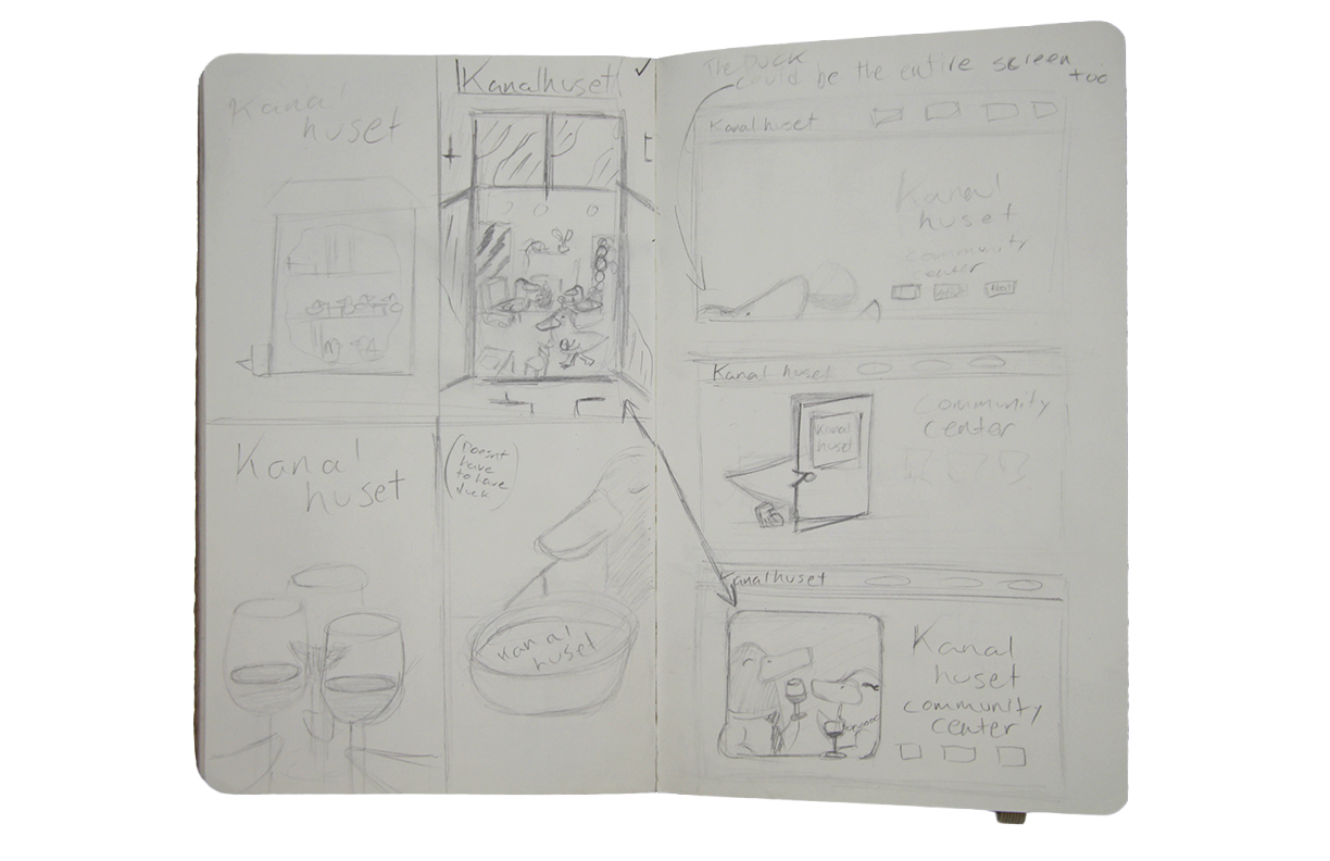
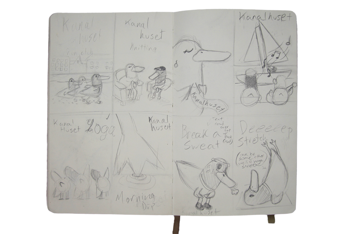
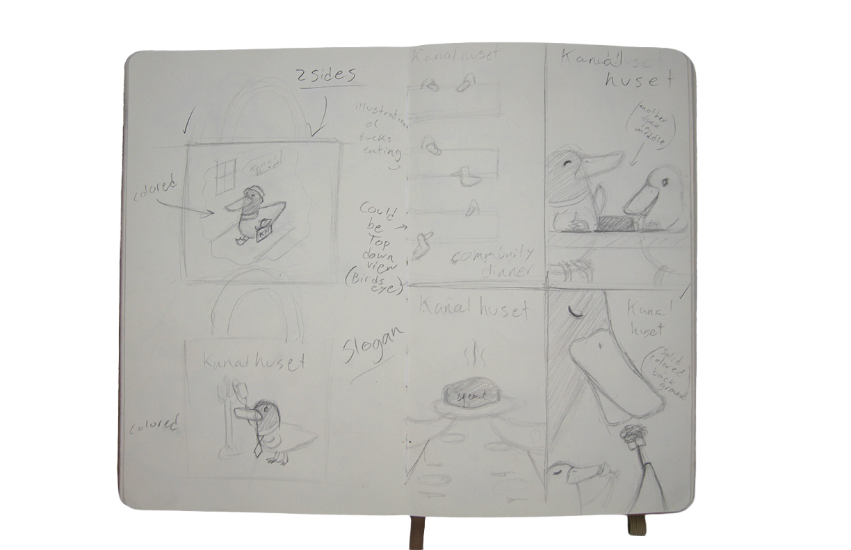
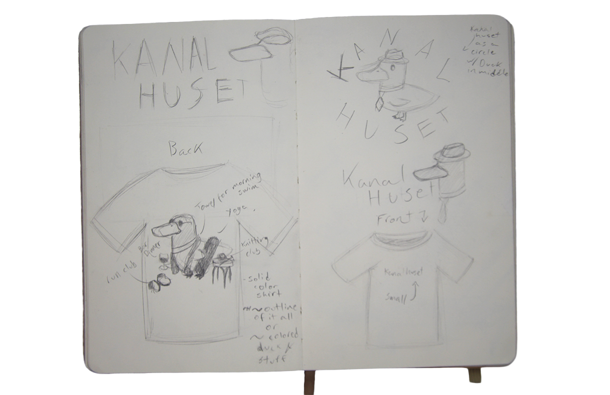
After finalizing the logo, I began sketching posters and product design concepts.
Final Designs
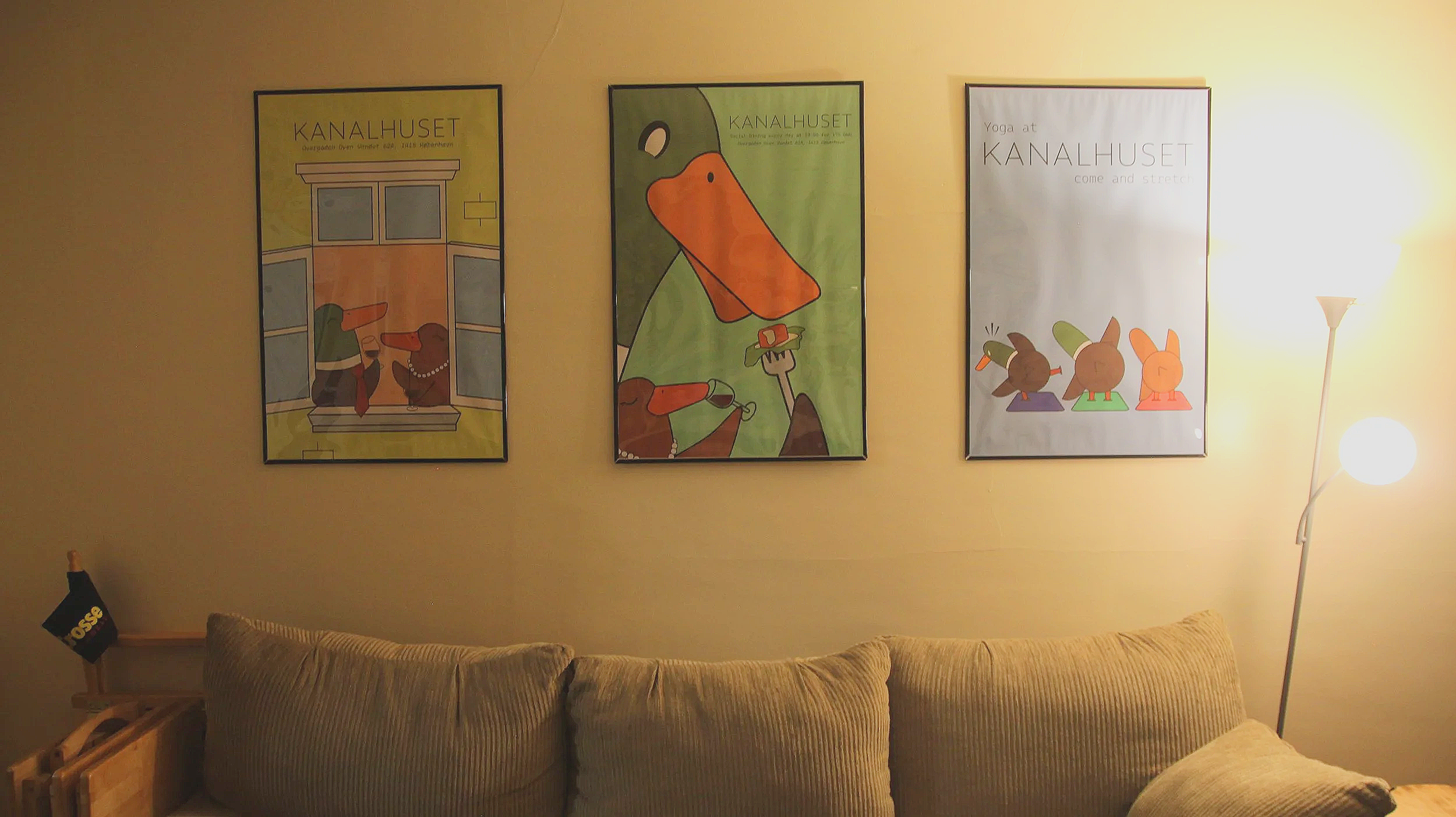
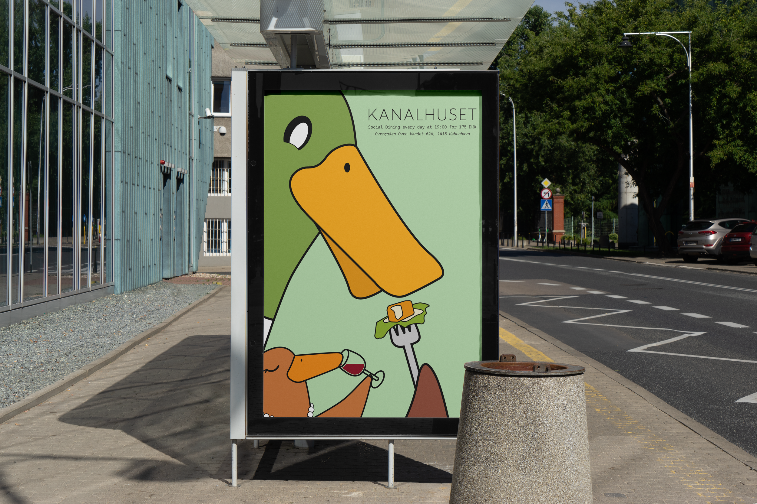
Social Dining Poster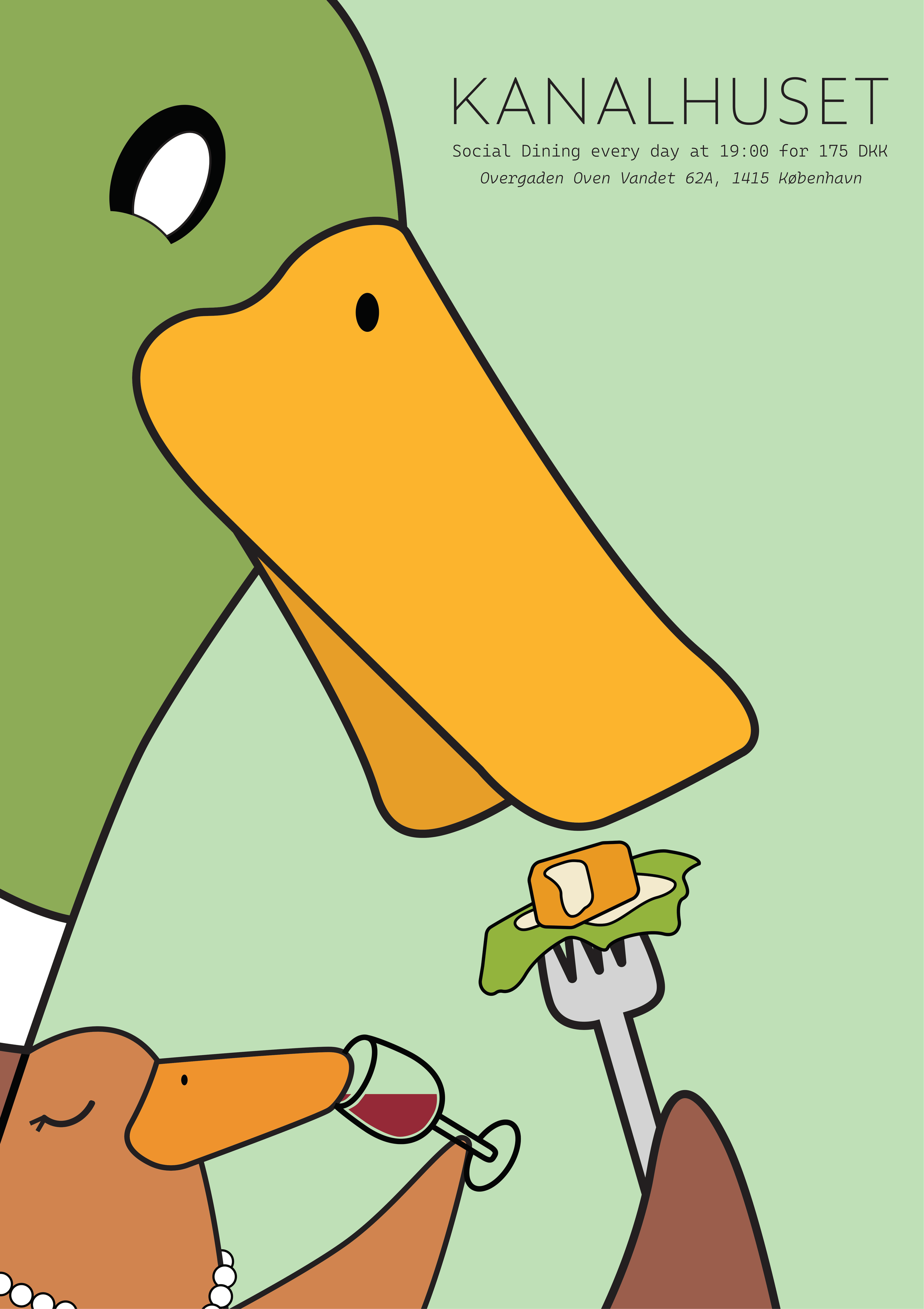
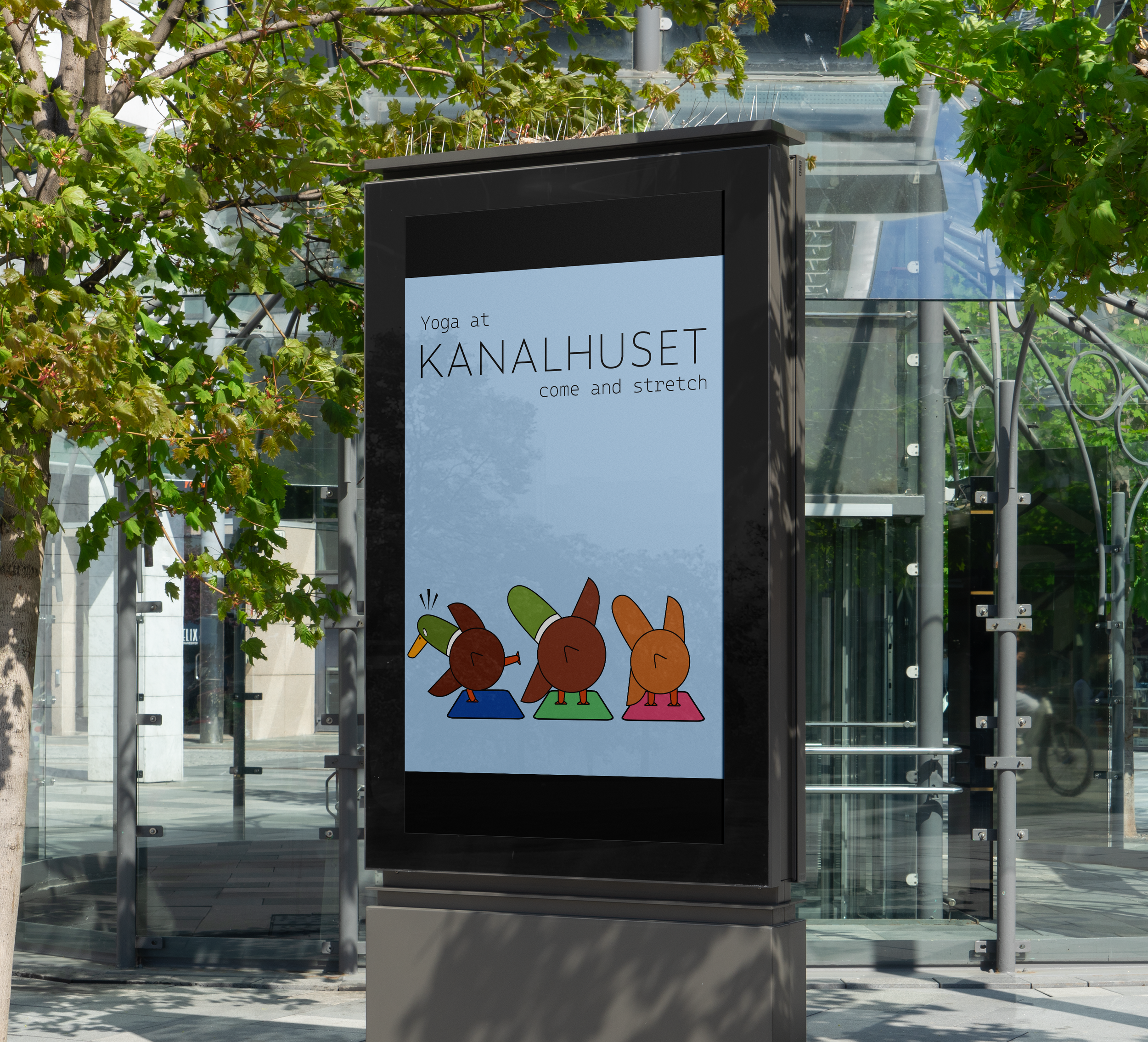
Activity Poster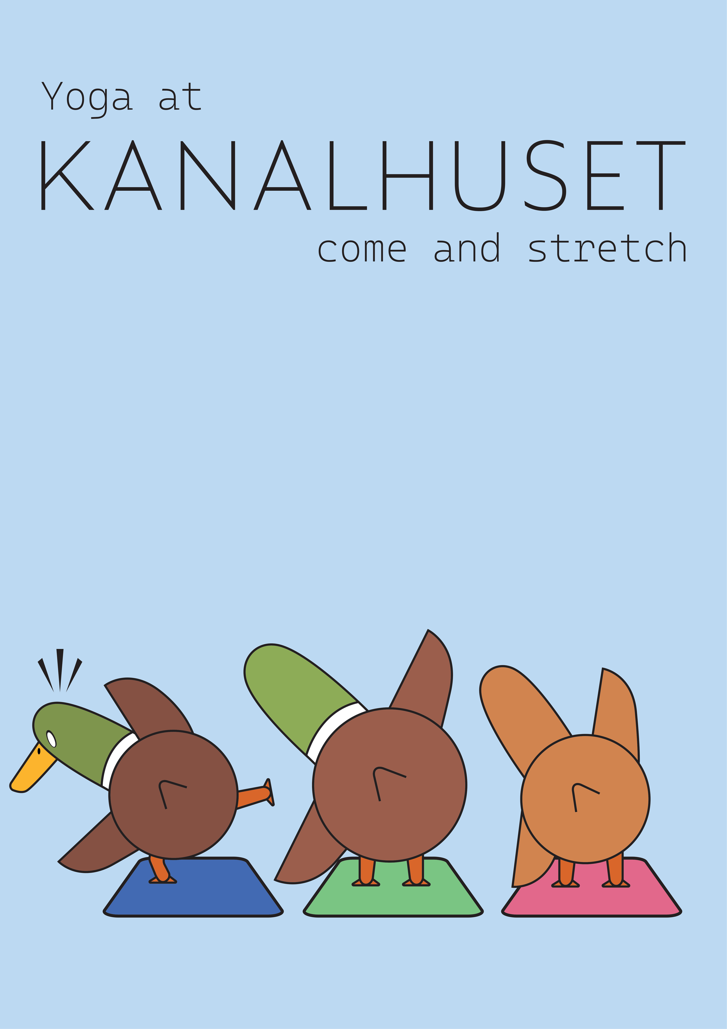
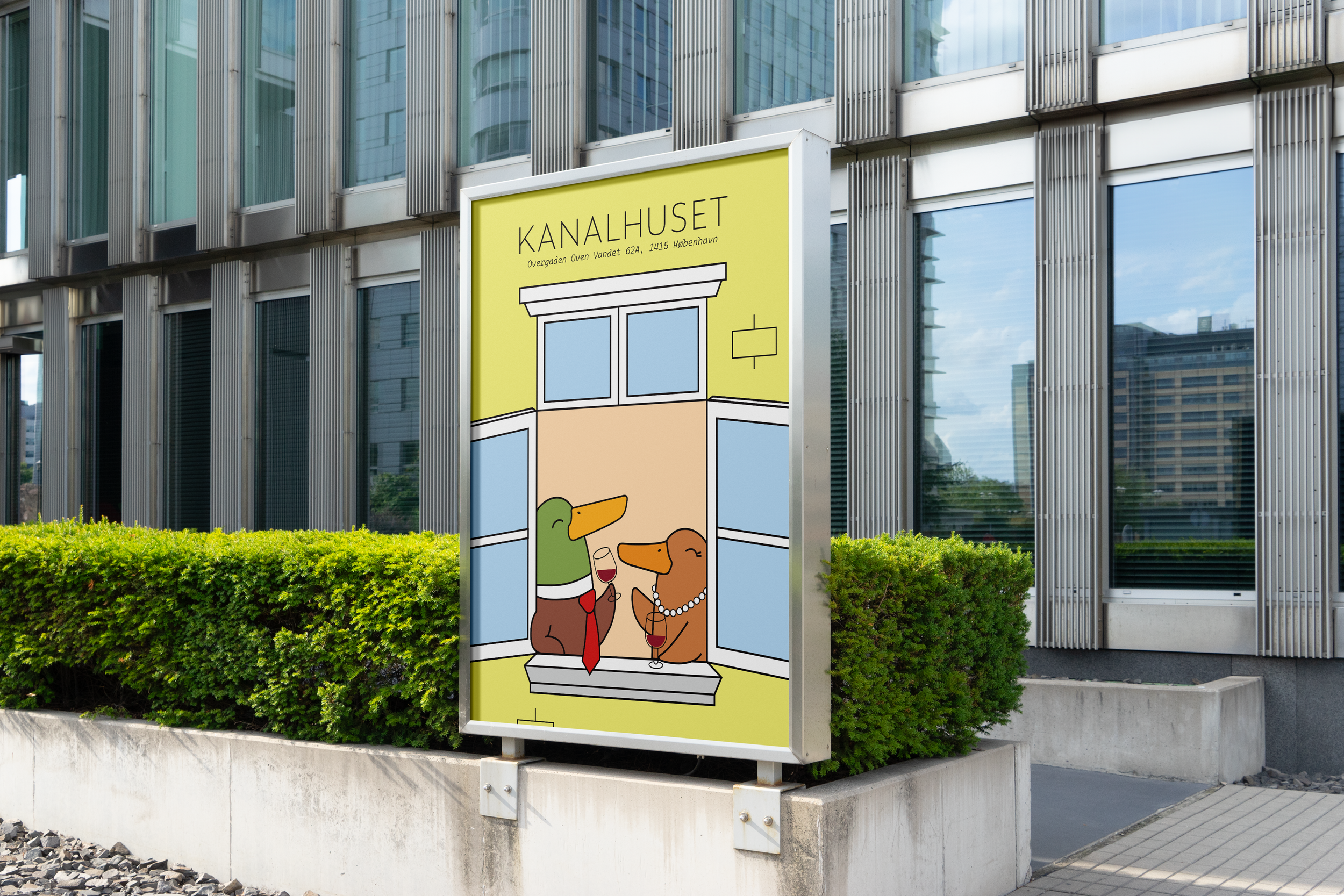
Kanalhuset Poster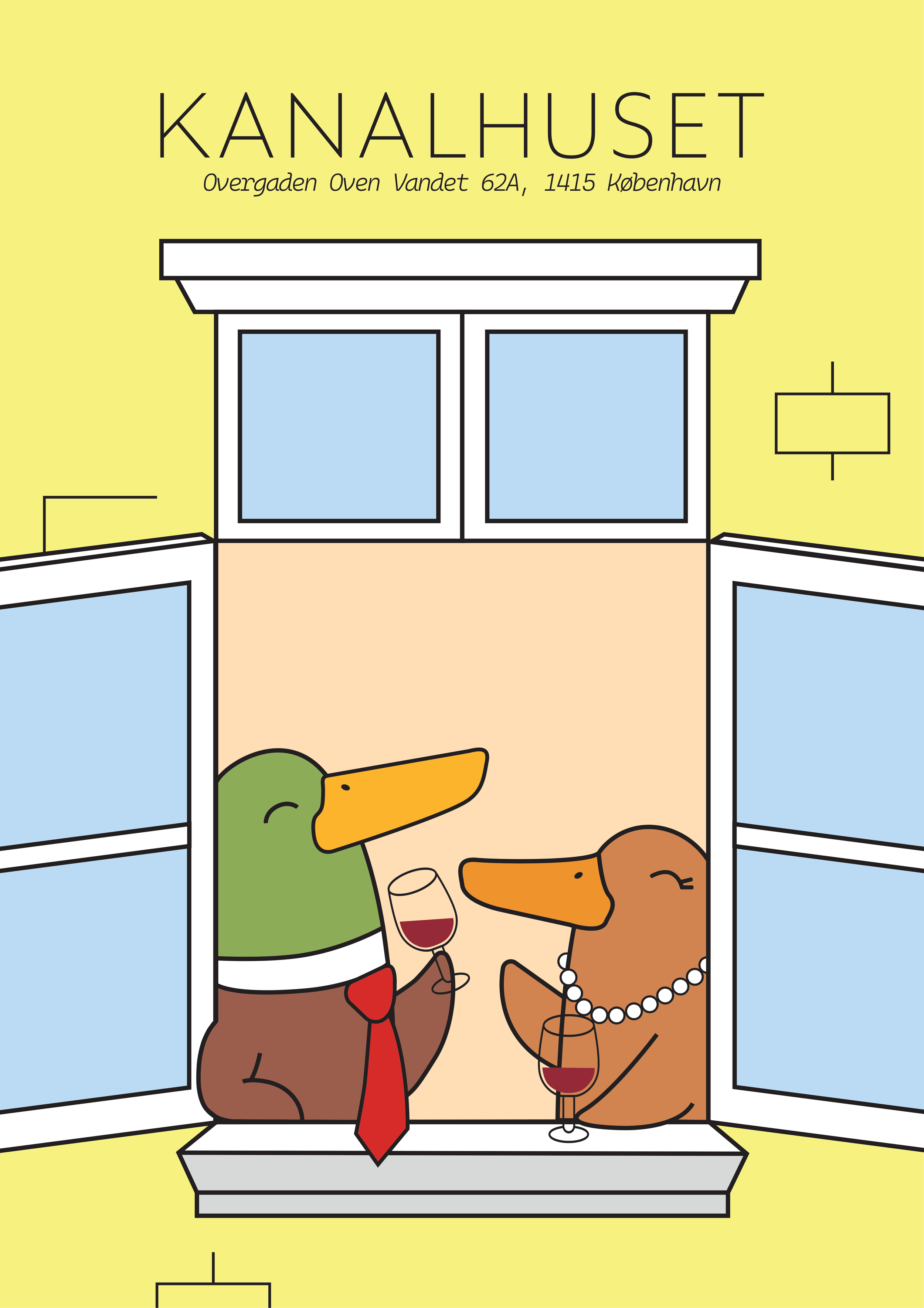
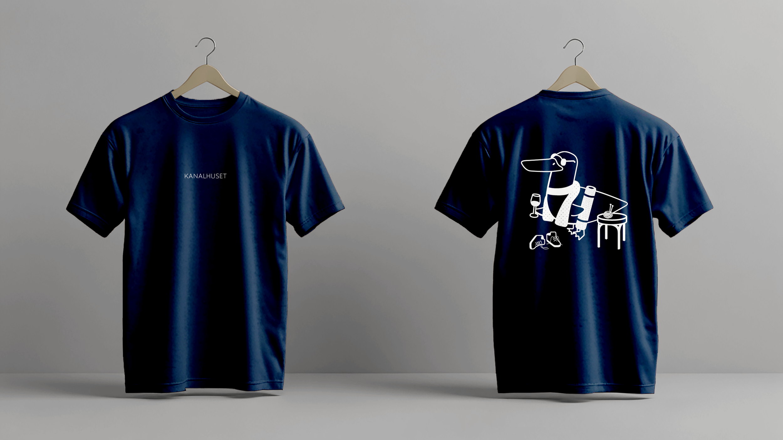
T-Shirt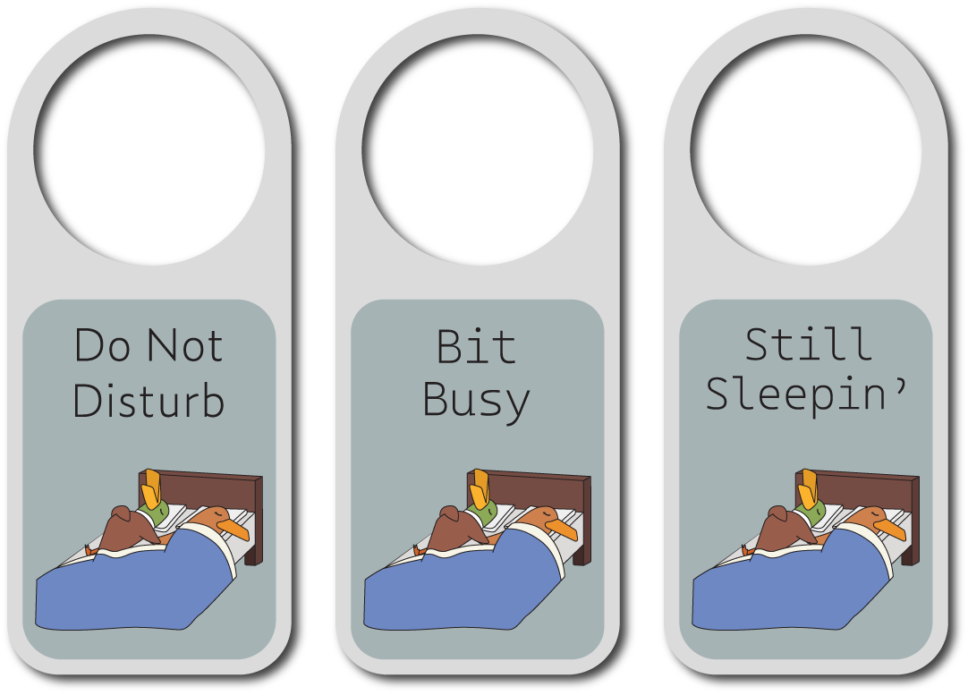
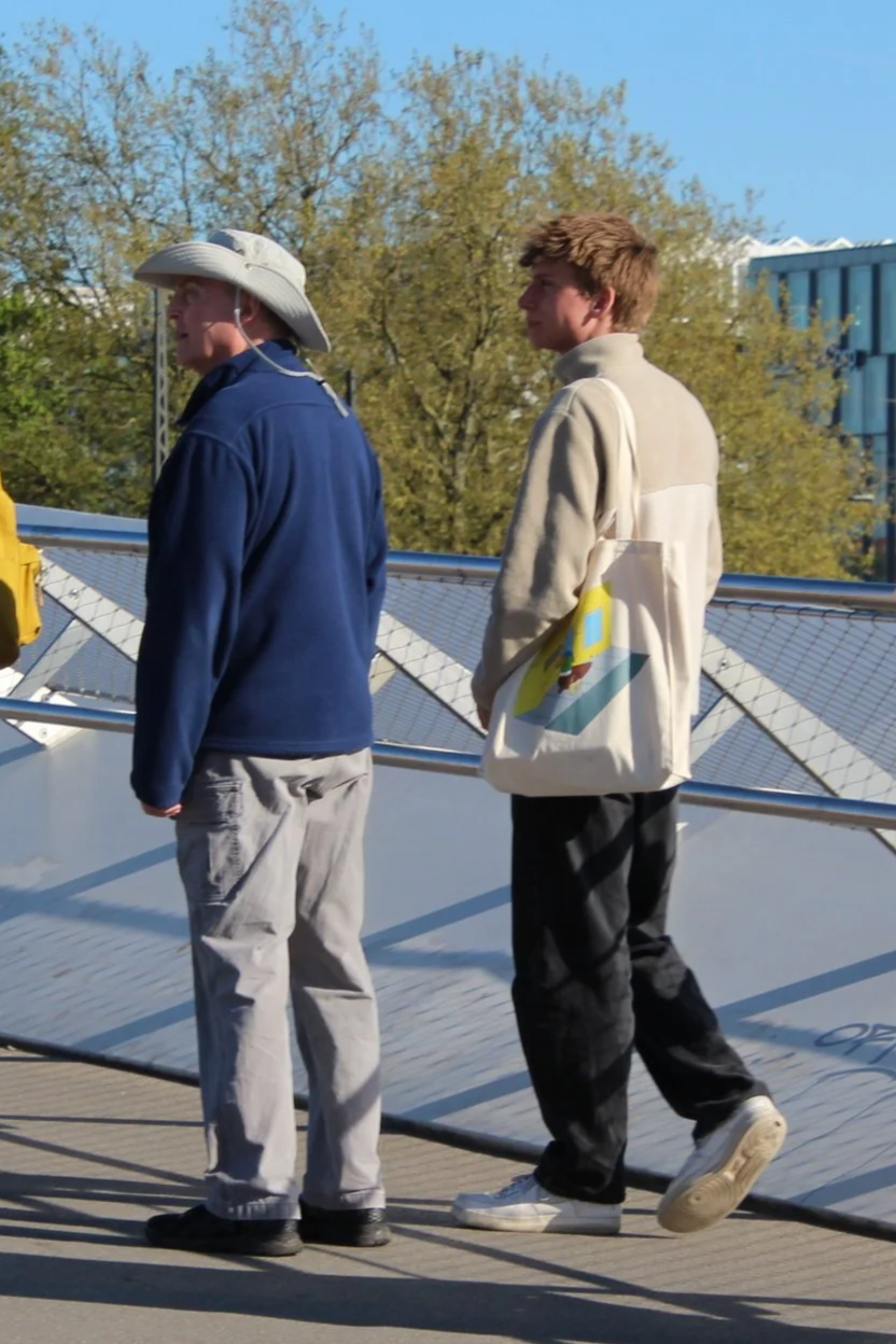
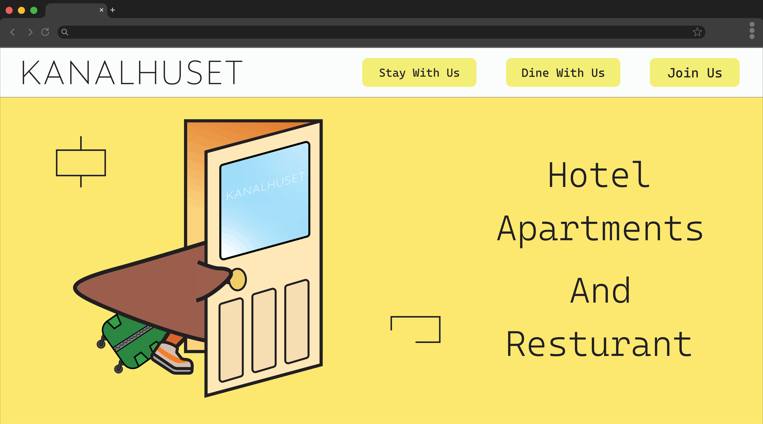
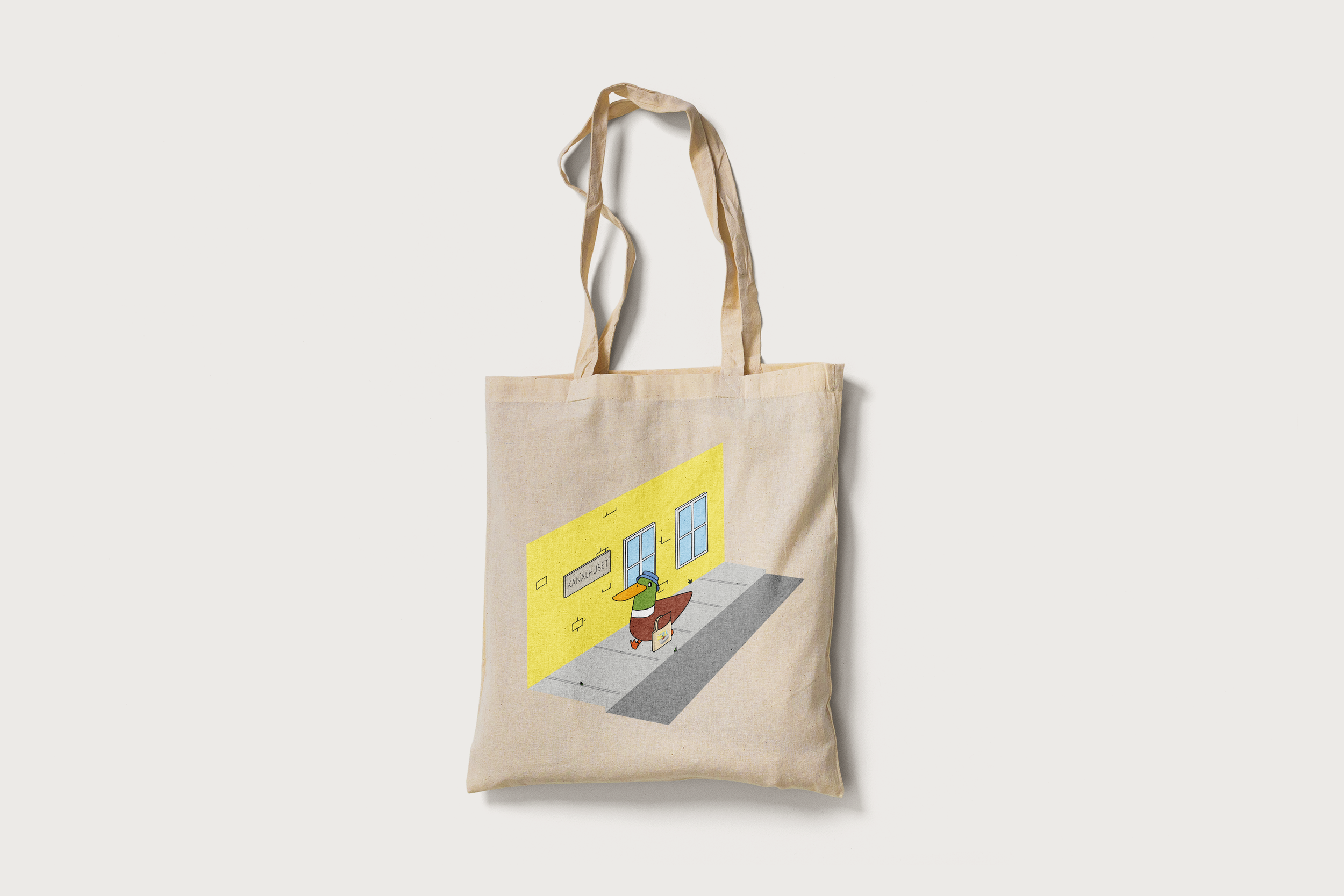
Home Page WebsiteTote Bag
Cork Coasters
Napkins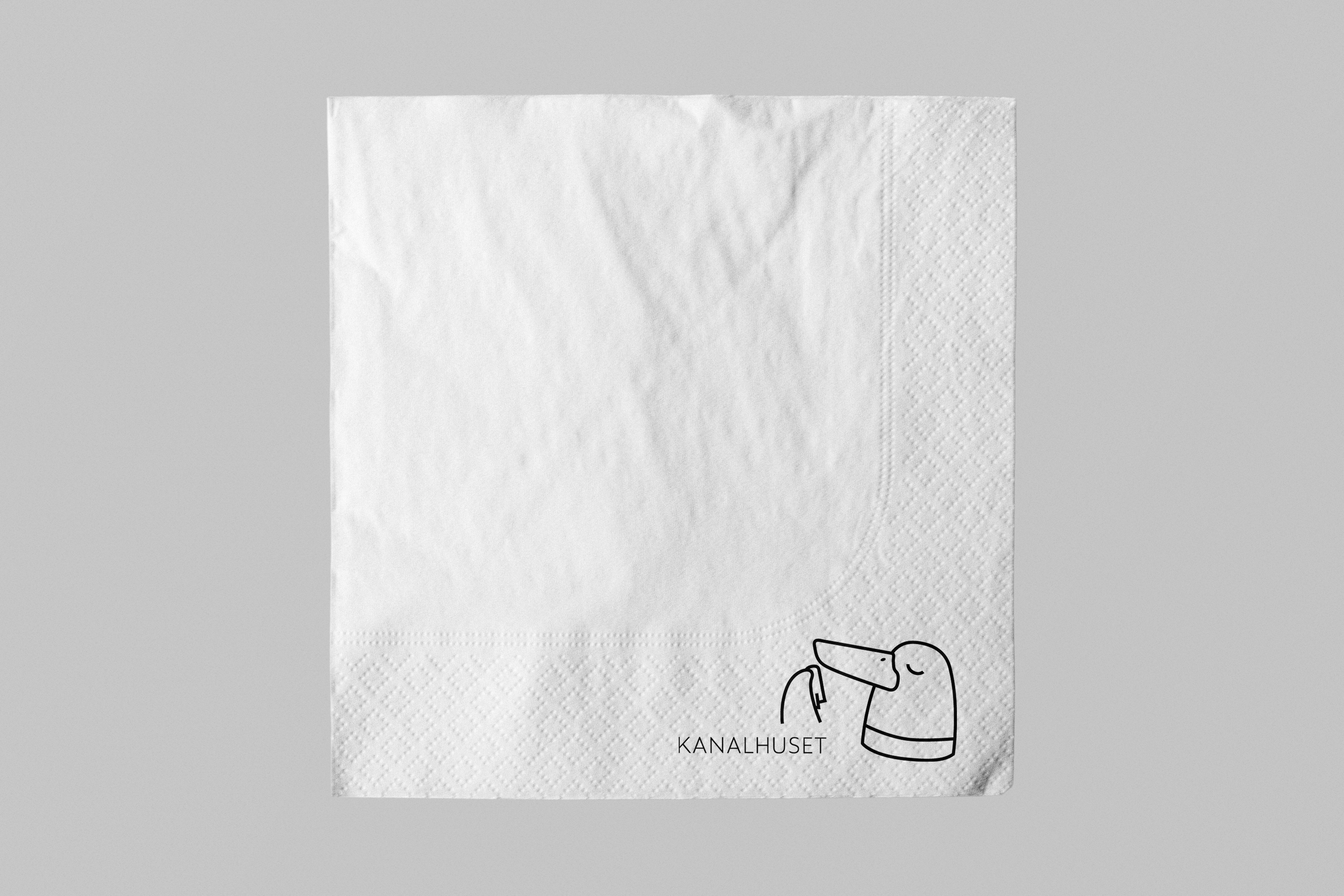
Door HangersPhysical Creations